
Start From a Finished Design: Meet the Template Gallery

You already know what you want to send. Two hundred course certificates. A rent increase notice for every tenant. This quarter's invoices. The part that stalls you is never the sending, it's the blank page before it: choosing a layout, lining up the fields, deciding where the logo goes, and quietly wondering whether the whole thing looks like it came from a real organisation.
The new template gallery removes that step. Open the wizard, pick a category, pick a design you like, and you have a finished document with the personalized fields already in place. No design work, no starting from nothing.
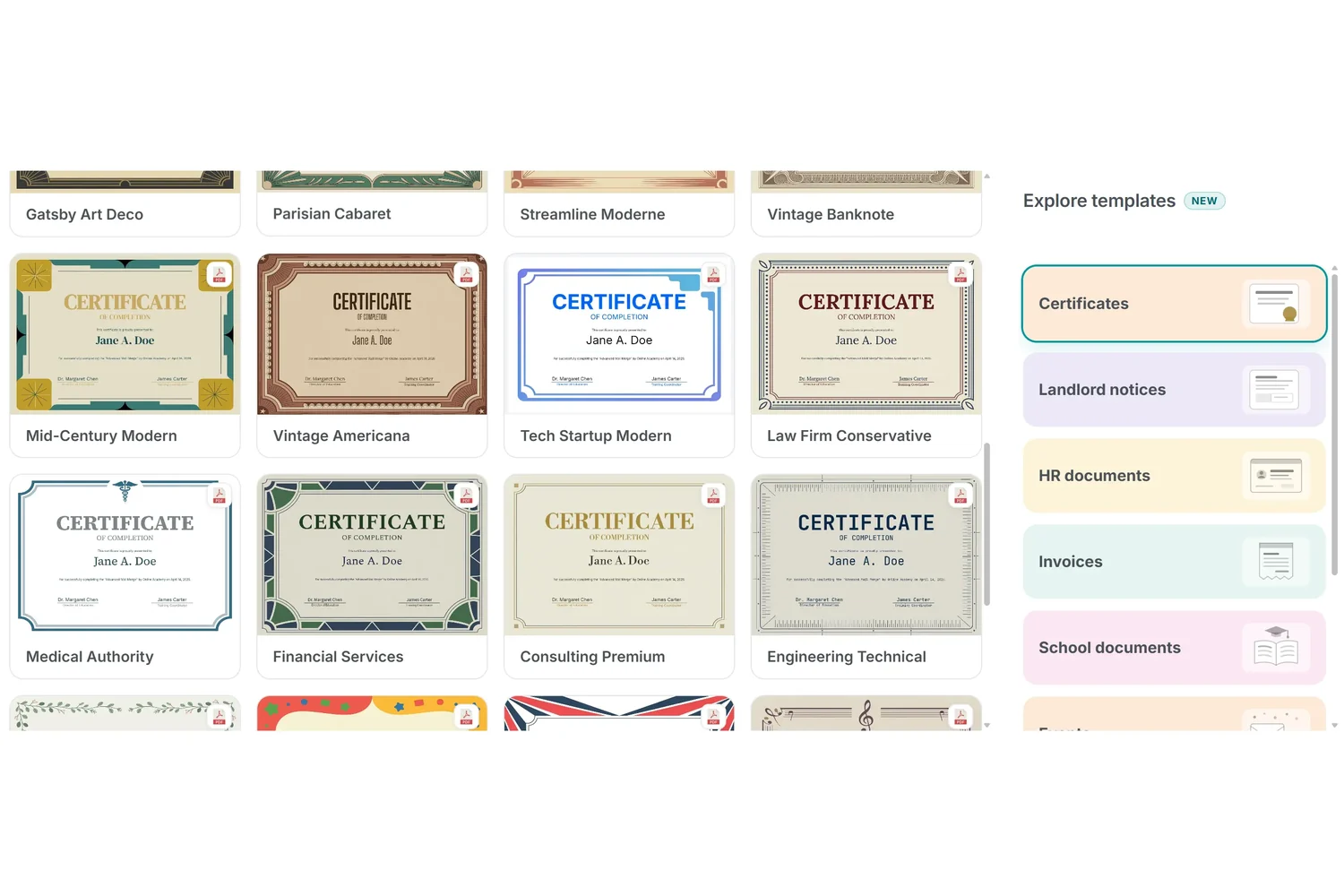
What's inside
The gallery opens with seven categories, and every design in them was drawn for this purpose rather than borrowed from a stock pack:
- Certificates: 30 PDF designs, from classical diplomas and heraldic crests to Scandinavian minimal, sports awards, children's awards and film festival styles
- Invoices: 20 spreadsheet designs with the line items, totals and tax rows already calculating
- Landlord notices: 13 Word documents covering the letters tenants actually receive
- HR documents: 10 Word documents for the paperwork that follows a hire, a review or a departure
- School documents: 10 Word documents for reports, permissions and parent letters
- Events: 10 Word designs for passes, programmes and attendee paperwork
- Membership: 10 Word designs for cards, renewals and welcome packs
That is 103 templates on the day this went live, and more categories are on the way. Tickets, invitations, packaging labels and tax forms already have their place in the gallery, waiting to be filled.
How it works
Every template arrives with its personalized fields already positioned. A certificate knows where the recipient's name belongs, an invoice knows which cells hold the line items, a notice knows where the address block sits. You are not placing anything from scratch, you are filling something in.
The matching spreadsheet comes with it too. Next to each template there's a sample spreadsheet download built from that template's own fields, so the column headers are already the right ones. Fill in your rows, upload it, and the columns line up on the first try instead of after three attempts at guessing the names.
You can look before you commit. Open any design in the preview and you see it rendered with realistic sample data, at its real size and in its real format, so you know what a finished document looks like before a single credit is spent.
And nothing is locked. Once a template is yours it behaves like any other: change the wording, swap the fonts and colours, drop in your own logo, move a field, add another. The gallery is a starting point, not a cage.
Where it helps
- You need it today: the course finished this morning and the certificates were due yesterday. Pick a design, upload the roster, run the mail merge
- You don't have a designer: small teams rarely do, and a template that was drawn properly saves you from a layout that quietly says otherwise
- The document has rules: notices and HR letters have a shape people expect. Starting from one that already has that shape means fewer things to get wrong
- You're trying MailMergic out: the fastest way to see what a mail merge actually does is to run one end to end with a template and sample sheet that already fit each other
Have a look
The gallery sits at the first step of the wizard, right beside the upload area. Your own file still goes there whenever you have one. When you don't, or when the blank page is the thing standing between you and a finished batch, browse the designs instead and start from something that already looks the way it should.
Open the wizard, pick a category, and see how far along your document already is.
